Econometrics, economics, finance, random rants.

Econometrics, economics, finance, random rants...
Showing posts with label Graphics. Show all posts

Wednesday, September 19, 2018

Wonderful Network Connectedness Piece

Very cool NYT graphics summarizing U.S. Facebook network connectedness.  Check it out:
https://www.nytimes.com/interactive/2018/09/19/upshot/facebook-county-friendships.html?action=click&module=In%20Other%20News&pgtype=Homepage&action=click&module=News&pgtype=Homepage


They get the same result that Kamil Yilmaz and I have gotten for years in our analyses of economic and financial network connectedness:  There is a strong "gravity effect" -- that is, even in the electronic age, physical proximity is the key ingredient to network relationships. See for example:

Maybe not as surprising for facebook friends as for financial institutions (say).  But still... 

Sunday, July 9, 2017

On the Identification of Network Connectedness

I want to clarify an aspect of the Diebold-Yilmaz framework (e.g., here or here).  It is simply a method for summarizing and visualizing dynamic network connectedness, based on a variance decomposition matrix.  The variance decomposition is not a part of our technology; rather, it is the key input to our technology.  Calculation of a variance decomposition of course requires an identified model.  We have nothing new to say about that; numerous models/identifications have appeared over the years, and it's your choice (but you will of course have to defend your choice). 

For certain reasons (e.g., comparatively easy extension to high dimensions) Yilmaz and I generally use a vector-autoregressive model and Koop-Pesaran-Shin "generalized identification".  Again, however, if you don't find that appealing, you can use whatever model and identification scheme you want.  As long as you can supply a credible / defensible variance decomposition matrix, the network summarization / visualization technology can then take over.


Wednesday, May 11, 2016

Great Yield Curve Graphic


I'm giving an overview lecture today on certain aspects of yield curves and their modeling, which reminds me of this phenomenal NYT interactive graphic.  CLICK HERE to get going, and give it time to load.  Then click "next" to go through nine fascinating graphics, ending with Germany and Japan.  You can also grab and rotate each graphic with your mouse.


Sunday, April 24, 2016

The Distribution of Global Economic Activity...

... as proxied by the global distribution of nighttime lights (from a fascinating new paper by Hendersen et al.).  Like many good graphics, this one repays careful study.  You'll see lots of places where the lights match your prior, but you'll also see places that are perhaps "surprisingly" well-lit relative to popular perceptions (e.g., central America), other places that are perhaps surprisingly dark (e.g., most of Russia), fascinating patterns (e.g., look at Europe stretching east into Russia), etc.

Thursday, June 4, 2015

2015 French Open Djokovic-Nadal Tennis Graphic, and Some Explanation

We now have the ability to produce our tennis graphic in near-real time. Here's Djokovic-Nadal from the French Open quarterfinals, 4 June 2015. The graph below plays quickly (click on it to enlarge and replay), but as usual on my web page we also have medium and slow versions that preserve more drama. I'll stop posting the graphs to No Hesitations unless we come up with something methodologically new; instead, they'll just be on my web page. Moving forward, I hope to post graphics at least for Men's and Women's grand slam finals.


One thing. People are sometimes confused as to what we're doing. We are not modeling the conditional probability that Mr. X wins the match, updated dynamically. That's very interesting, and there is good work in that direction by Klassen and Magnus, among others. But that's not what we want to do, and it's not what our graphic shows. Instead, we simply want to provide an informative visual summary of a match, doing for tennis precisely what box scores do for baseball, only better.

Monday, March 23, 2015

Run Over by a Bus

Thanks for your concerned emails.  No, I have not been run over by a bus, just crazy busy with no time for new posts in the past few weeks.  We'll see how the next few go.  Meanwhile, here's the latest tennis graphic.  It's now dynamic; when it stops playing, just click on it to blow it up and re-play.


This graphic is for yesterday's Indian Wells Championship.  To really feel the drama, you'll want the slower animation.  I'll post on my web page one of these days.  In the future we'll shade tiebreakers, such as the second-set tiebreaker in the Djokovic-Federer match above. What else should we do?

Monday, February 23, 2015

Tennis Graphic Version 2

The tennis graphic is coming along; here's version 2 static. Thanks for the earlier comments on version 1 (more emailed than posted, you technophobes). Same Federer-Monfils example below. We now simply show points-from-set, set-by-set. (Sorry I had to shrink it to fit the blog format; you can blow it up using Ctrl+ in your browser.) I am exceptionally grateful to our talented "tennis team," especially Bas Bergmans, Modibo Camara, Joonyup Park, and Ken Teoh.


(Compare Version 1, here, which instead tracked points-from-match, set-by-set, with shading to convey intra-set developments.)

Sunday, January 25, 2015

Nassim Taleb Graphic

This arrived a couple weeks ago from Nassim Taleb. Regardless of where your view falls on the black swan spectrum, I hope you'll like the graphic. One hallmark of a good graphic is that it repays careful study, as with a good map (which is a good graphic). Nassim's Genealogy certainly passes that test. I found myself thinking about its contents and assertions for a long time. (You can blow it up in your browser by clicking on it. That should do the trick, but if it's still not big enough, start hitting ctrl+.)   


Monday, December 8, 2014

A Tennis Match Graphic

I know you're not thinking about tennis in December (at least those of you north of the equator). I'm generally not either. But this post is really about graphics, and I may have something that will interest you. And remember, the Australian Open and the 2015 season will soon be here.

Tennis scoring is different and tricky compared to other sports. A 2008 New York Times piece, "In Tennis, the Numbers Sometimes Don't Add Up," is apt:
If you were told that in a particular match, Player A won more points and more games and had a higher first-serve percentage, fewer unforced errors and a higher winning percentage at the net, you would deduce that Player A was the winner. But leaping to that conclusion would be a mistake. ... In tennis, it is not the events that constitute a match, but the timing of those events. In team sports like baseball, basketball and football, and even in boxing, the competitor who scores first or last may have little bearing on the outcome. In tennis, the player who scores last is always the winner.
Tricky tennis scoring makes for tricky match summarization, whether graphically or otherwise. Not that people haven't tried, with all sorts of devices in use. See, for example, another good 2014 New York Times piece, "How to Keep Score: However You Like," and the fascinating GameSetMap.com, "A blog devoted to maps about tennis," emphasizing spatial aspects but going farther on occasion.

Glenn Rudebusch and I have been working on a graphic for tennis match summarization. We have a great team of Penn undergraduate research assistants, including Bas Bergmans, Joonyup Park, Hong Teoh, and Han Tian. We don't want a graphic that keeps score per se, or a graphic that emphasizes spatial aspects. Rather, we simply want a graphic that summarizes a match's evolution, drama, and outcome. We want it to convey a wealth of information, instantaneously and intuitively, yet also to repay longer study. Hopefully we're getting close.

Here's an example, for the classic Federer-Monfils 2014 U.S. Open match. I'm not going to explain it, because it should be self-explanatory -- if it's not, we're off track. (But of course see the notes below the graph. Sorry if they're hard to read; we had to reduce the graphic to fit the blog layout.)


Does it resonate with you? How to improve it? This is version 1; we hope to post a version 2, already in the works, during the Australian open in early 2015. Again, interim suggestions are most welcome.

Friday, April 18, 2014

Monday, March 31, 2014

Student Advice I: Some Good Reading for Good Writing (and Good Graphics)

                            
Good writing is good thinking, so when you next hear some pretentious moron boast that ``I don't like to write, I like to think," rest assured, he's surely a bad writer and a bad thinker. Again, good writing is good thinking. If you like "to do research" but don't like "to write it up," then you're not thinking clearly. Research and writing are inextricably intertwined.

The Elements of StyleHow to get there? Read and absorb McCloskey's Rhetoric of Economics, and Strunk and White's Elements of Style. There's no real need to read or absorb much else (about writing). But do bolt the Chicago Manual of Style to your desk. Then get going. Think about what you want to say, why, and to whom. Think hard and critically about logical structure and flow, at all scales, small and large. Revise and edit, again and again. Make things easy for your readers.  Listen to your words; push your prose toward poetry. 

VDQI Book Cover

Good graphics is also good thinking, and precisely the same advice holds. Read and absorb Tufte's Visual Display of Quantitative Information. Notice, by the way, how well Tufte writes (even if he sometimes goes overboard with the poetry thing). It's no accident. As Tufte says: show the data, and appeal to the viewer. Recognize that your first cut using default software settings will never, ever, be satisfactory. (If that statement doesn't instantly resonate with you, then you're in desperate need of a Tufte infusion.) So revise and edit, again and again. And again. 

Tuesday, July 16, 2013

The Latest in Statistical Graphics

In a recent gushing review, The Economist made Data Points: Visualization that Means Something by Nathan Yau (Wiley, 2013) sound like the elusive "Tufte for the 21st-Century" discussed in an earlier post (Statistical Graphics: The Good, The Bad, and the Ugly, June 21, 2013). Alas, it's not. Much of it is just inferior re-hash of old 20th-century Tufte. Nevertheless I like it and I'm glad I bought it. Among other things, there are some really cute examples, like this one showing the available colors of Crayola crayons over time.

Published by Stephen Von Worley. Designed by Velociraptor. See links below.

(Yes, I know it's not original to Yau, and I know it's comparatively easy to use clever color in a Crayola graphic, but still...) Crayola also brings back good memories: I was a user/fan in the 64-color days of 1958-1972, not only for the awesome 64 colors but also for the totally-cool tiered box with built-in sharpener!

Perhaps most interesting is Yau's final chapter, where he offers opinions on graphics software environments. (After all, he spends his life doing this stuff, so it's interesting to learn his preferences.) At a high "canned" level, he likes Tableau, the "Tableau Public" version of which is free. Well, nothing is really free, and Tableau Public follows an interesting paradigm: the price of using the web-based software is that users must upload their data so that others can use it.

But readers of this blog will be more interested in lower-level scientific software that allows for significant graph customization.  In that regard, and not surprisingly, Yau is an R fan. (See my earlier post, Research Computing / Data / Writing Environments, May 31, 2013.) He basically does all his graphics in R, but quite interestingly, he doesn't like to tune his graphs completely in R. Instead, he finalizes them using illustration software like the open-source Inkscape. Hmmm...

Yau's book also introduced me to his blog, FlowingData, which is interesting and entertaining. Also see Data Pointed, a fine blog by scientist and artist Sephen Von Worley, the author of the Crayola graphic above. And if you're really a Crayola maven, see his post, Somewhere Over the Crayon-Bow.

Finally, and ironically, the most interesting thing about Yau's book is not explicitly discussed in it, yet it lurks massively throughout: Big Data and its interaction with graphics. More on that soon.

Friday, June 21, 2013

Statistical Graphics: The Good, The Bad, and the Ugly

I love good graphics, so I love Edward Tufte's work, and I'm always amazed by the number of allegedly quant-aware people who are actually unaware of Tufte. His beautifully-produced first book, The Visual Display of Quantitative Information, is surely the all-time masterpiece on elements of graphical style, not to mention a tremendously engaging and entertaining read. He opened my eyes, massively, to everything from avoiding chartjunk (a marvelous Tufte term), to thinking hard about aspect ratios, to thinking similarly hard about whether/why/how to use color. Indeed I admire Tufte so much that I occasionally find myself jealous. Why can't I be Tufte? Why can't I be the graphics legend with the stunning ET Modern studio in Manhattan? Why didn't Apple ask me to design the iPhone GUI? Damn that miserable Tufte.


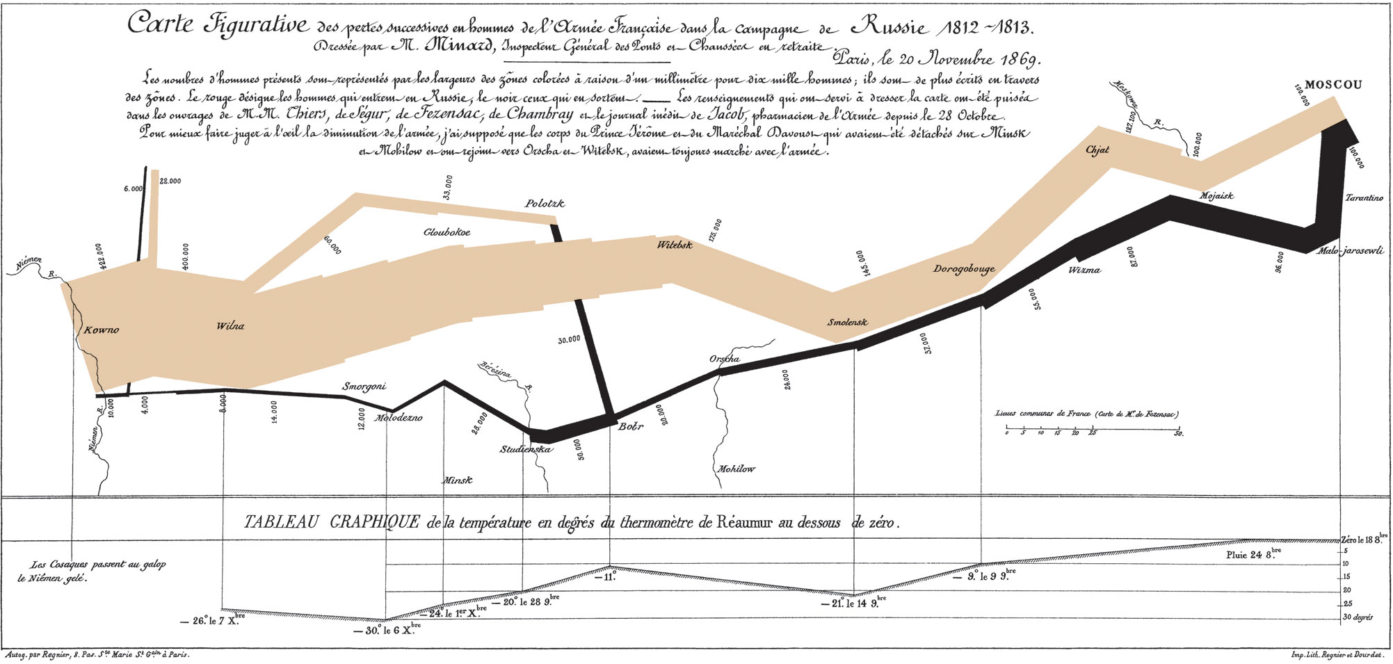
Tufte always says that Minard's Napoleon's March graphic, above, is the greatest ever. (Click here for detail.) Everyone else says that too, but they're just repeating Tufte. Notwithstanding the futility of "greatest ever" proclamations (except for rock guitarists -- it's clearly Jimmy Page, but that's another post...), Tufte might be right. Napoleon's March informs instantly, yet it simultaneously repays hours of careful scrutiny. It shows the French army advancing on Moscow (brown) and retreating due to the brutal winter (black), with path widths tracking the number of soldiers alive. It presents a huge amount of information compactly, telling a rich and textured story moving through space and time, beginning with bravado and devolving into disaster. 

Now consider the Univariate Distributional Relationships graphic below, by Larry Leemis et al. (American Statistician, 2008). I learned of it recently from Oscar Jorda and Glenn Rudebusch, two fine and graphics-aware economics researchers. At first I thought it was a joke, a great example of in-your-face bad graphics, perhaps entertaining (unintentionally) but failing to communicate seriously. A better title, I thought, would be Nightmares of the Statistical Jungle.

Now, a week later, I feel, well, the same.  But I've also come to view the American Statistician version of Leemis et al. as something of a static straw man, chained as it is to the printed page. It turns out that the Leemis et al. web page has a much better dynamic version. Moving the mouse over the graphic, each distribution is highlighted, together with its immediate relatives. And moving the mouse over any of the distributions listed on the left of the web page locates it and its relatives in the figure, and clicking provides more detailed information. All told, the dynamic version of Leemis et al. is engaging and useful.

Interestingly, consideration of Minard's Napoleon vs. Leemis et al.'s Distributions raises important and unresolved issues. Tufte's main mission is to describe how best to make "traditional" graphics, frozen on the static printed page, as with Minard's Napoleon, and his descriptions are of course also frozen on the same static printed page. But in recent decades the computer has catapulted us to dynamic and multi-layered graphics, with highlighting, brushing, spinning, clicking, etc., as with Leemis et al.'s dynamic Distributions. What are the key new principles of dynamic graphics, and how can one possibly describe them well in print? Tufte shrewdly skirts those issues in large part, leaving it to others to write a new "Tufte for the 21st Century." Pioneers like William S. Cleveland and his group at Bell Labs made early progress, and of course the modern dynamic graphics research program continues unabated. But it's still hard -- and it will always be hard -- to describe and discuss dynamic graphics insightfully on paper.

Will there ever be a Tufte for the 21st Century? Is it even possible? What would be its format? (Surely not paper.) And what, precisely, would it contain? The good news, I suppose, is that we have 87 years to continue working on it.